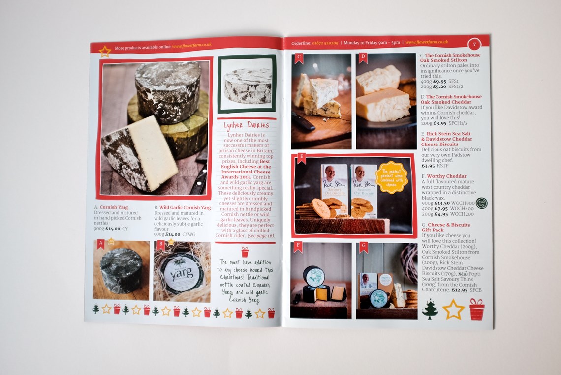
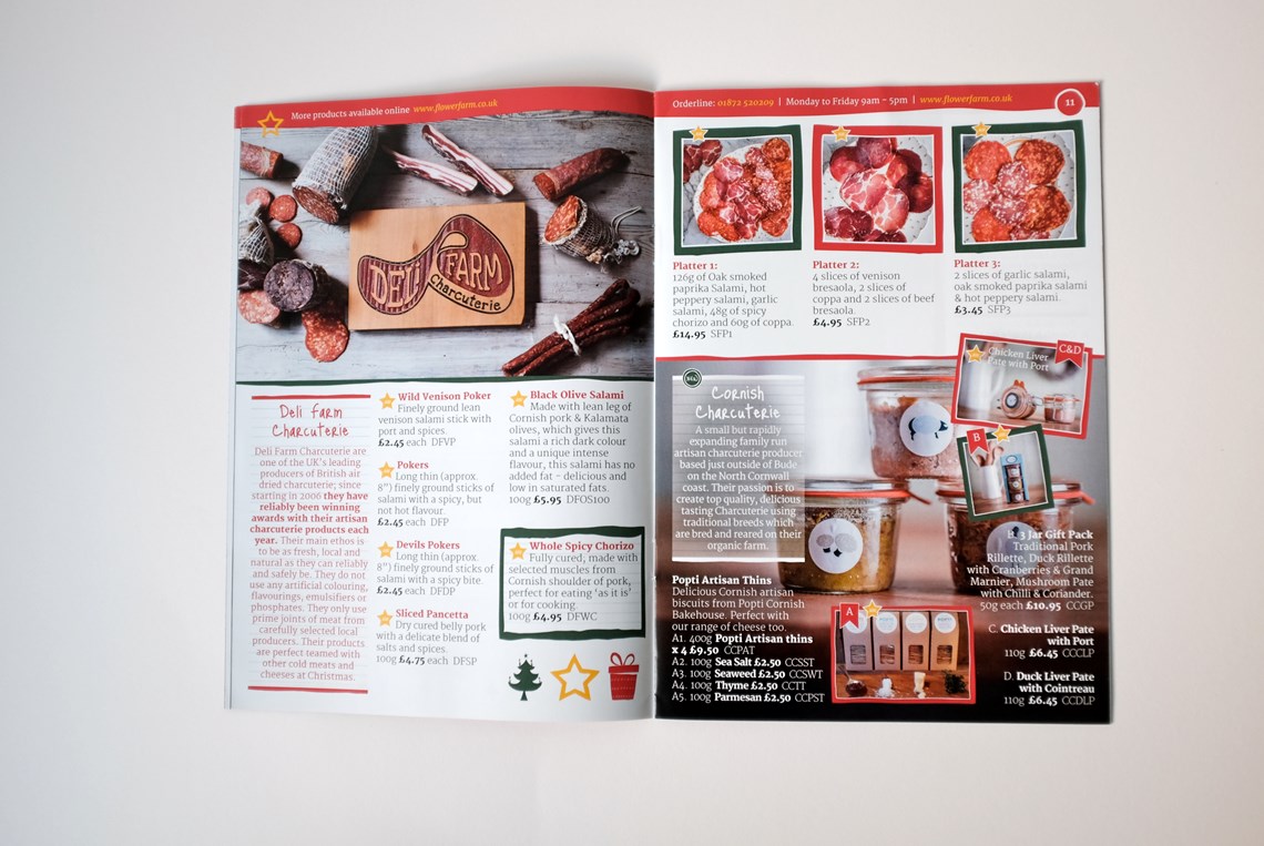
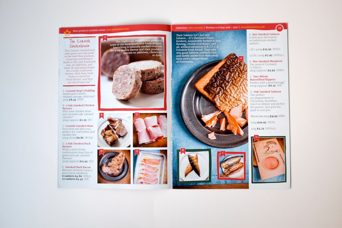
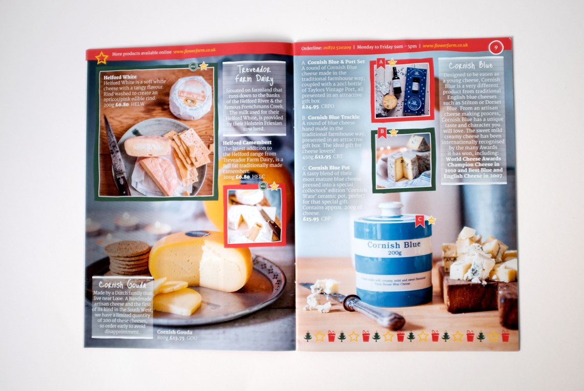
Fentongollan Farm
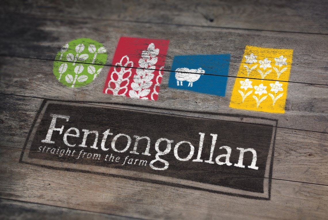
There are four main elements of the Fentongollan brand which I had to capture when taking on the re-brand project. The four symbols in the logo represent these four elements making it a highly adaptable brand.
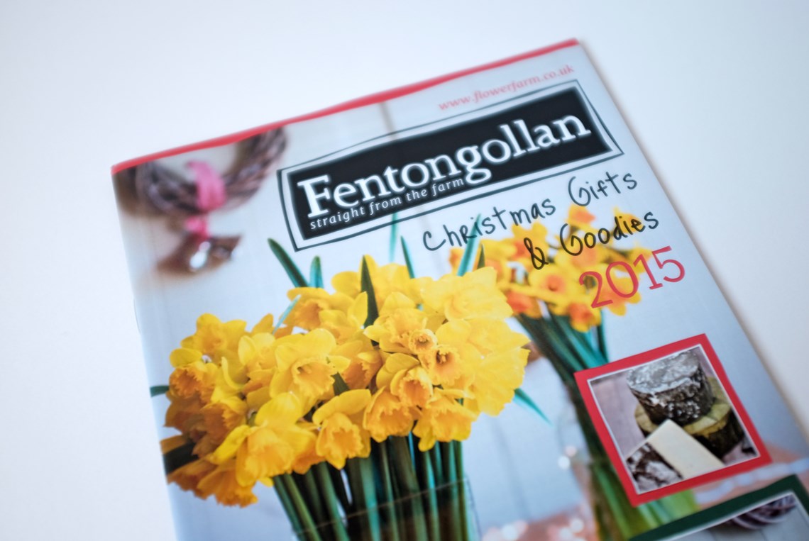
This lead the way for all future work including signage, catalogues and box packaging. They wanted their brand to be more personal and friendly, something I specialise in. By starting with a sketch book and hand-drawn illustrations I’m able to capture this feeling more effectively than working straight from a computer.
“Working with Rose has made my job a lot easier, she totally gets our brand, how our customers see us and therefore how to create the most effective designs for every aspect of our business. We are not just a retail business, we also sell to a wide range of trade businesses, as well as being a working farm, so our stakeholders are really varied and coming up with designs that appeal and apply to all the different aspects is a tricky one. Rose has done it with ease, and has come up with some truly stunning designs in the process. All in all she is a valued member of the team and we are so glad we have her on board.”
Katie Johns, Marketing Manager, Fentongollan Farm.